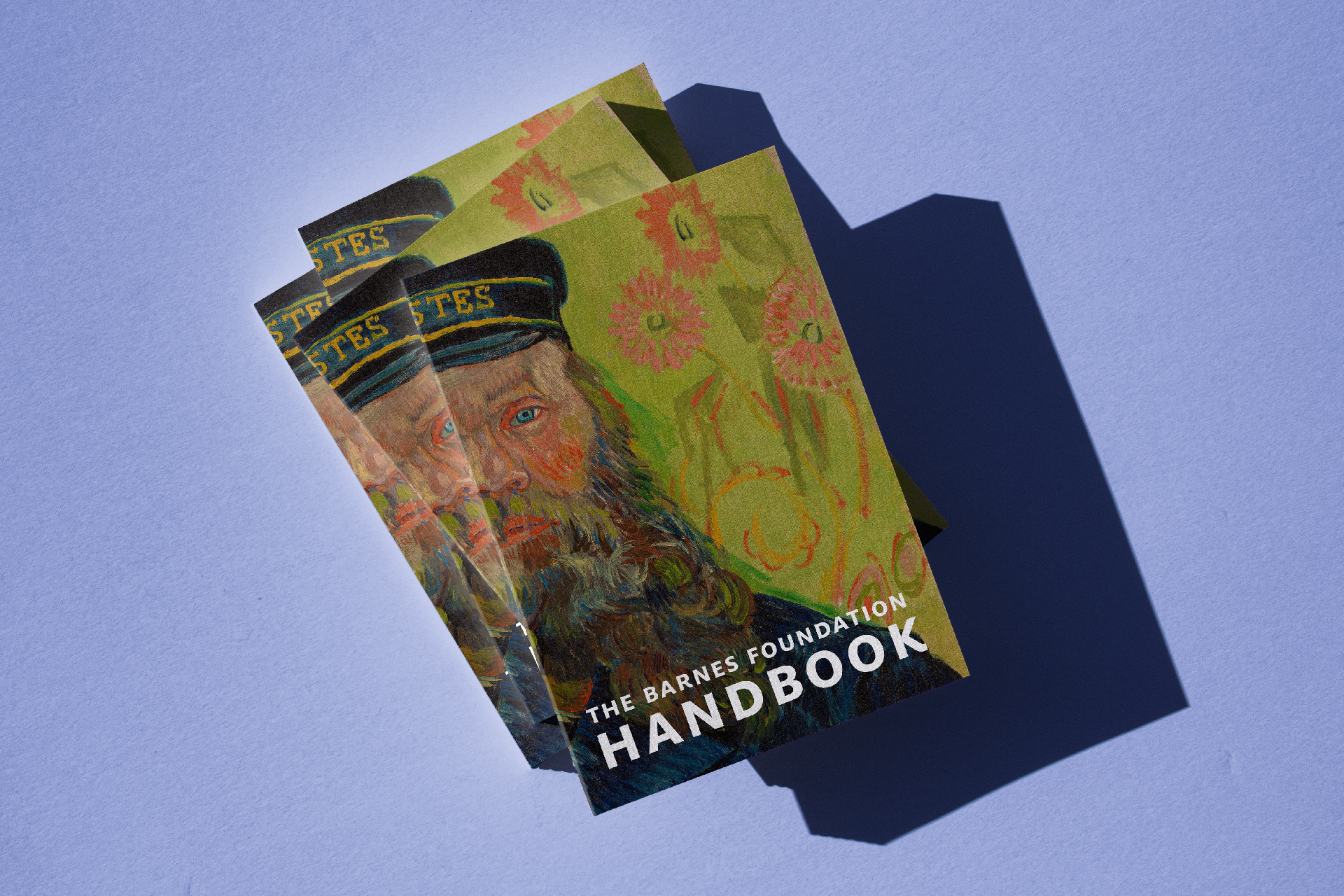
The Barnes Foundation Handbook is a compact, portable introduction to our renowned collection of art and objects. This lavishly illustrated book offers a room-by-room tour of the Barnes Foundation, with concise entries on 172 works in the collection ranging from important paintings by Vincent van Gogh, Paul Cézanne, Pierre-Auguste Renoir, Henri Matisse, and others, to metalwork, ceramics, textiles, furniture, and sculptures from Africa, Asia, and North America. An introduction and an essay on Dr. Albert Barnes's unique approach to displaying works of art place these objects in the larger context of the Barnes Foundation and its educational mission.
Please check back as I will be updating this project with additional images. To purchase a copy of the Handbook please visit the Barnes Shop.
+ Type: Calibre by Klim Type Foundry, Milo and Milo Serif by FontFont
+ Art Direction and Graphic Design: Olivia Verdugo
+ Additional Typesetting: Pauline Nyren
+ Collection Photography: Sean Murray
+ Printing: Brilliant Graphics
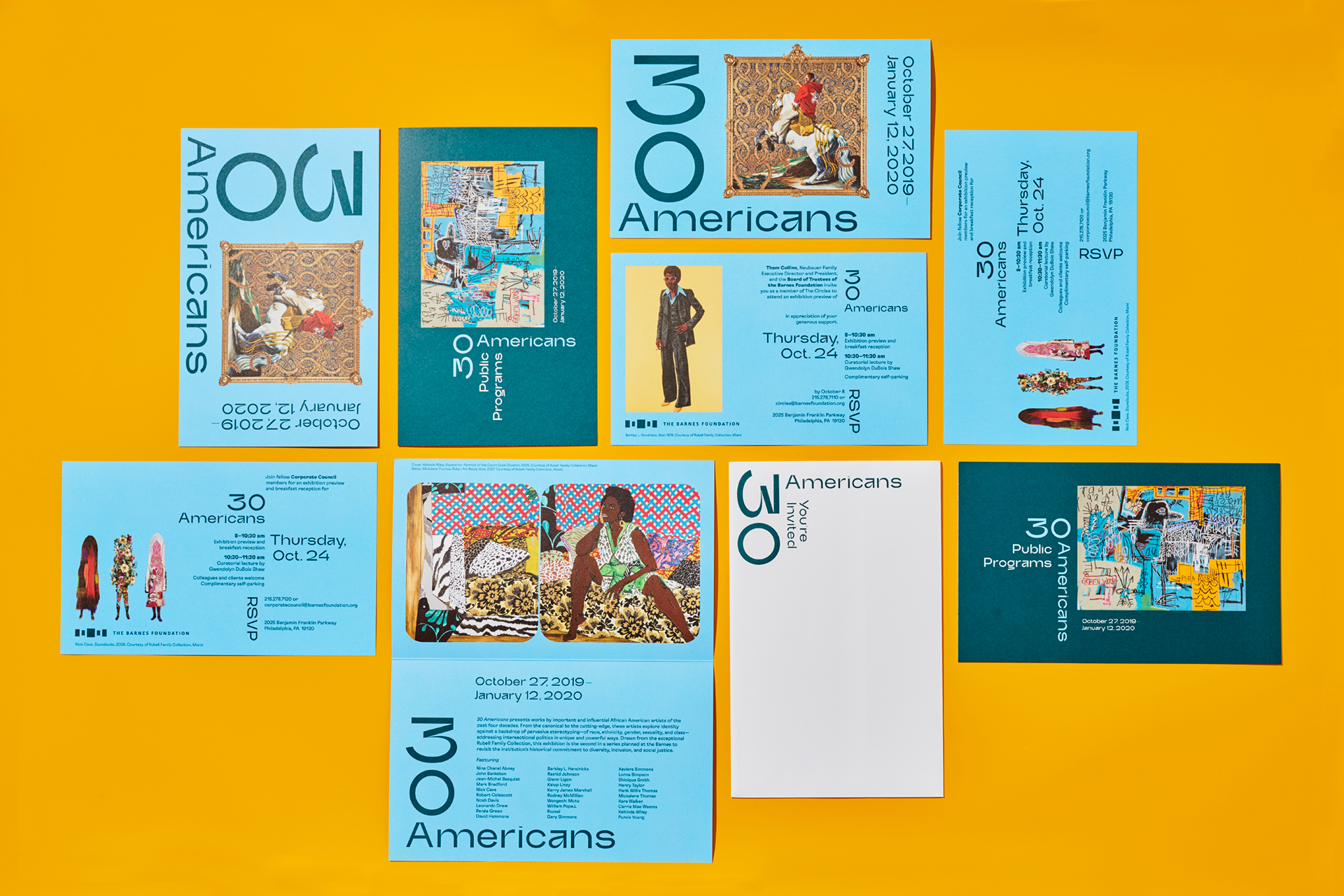
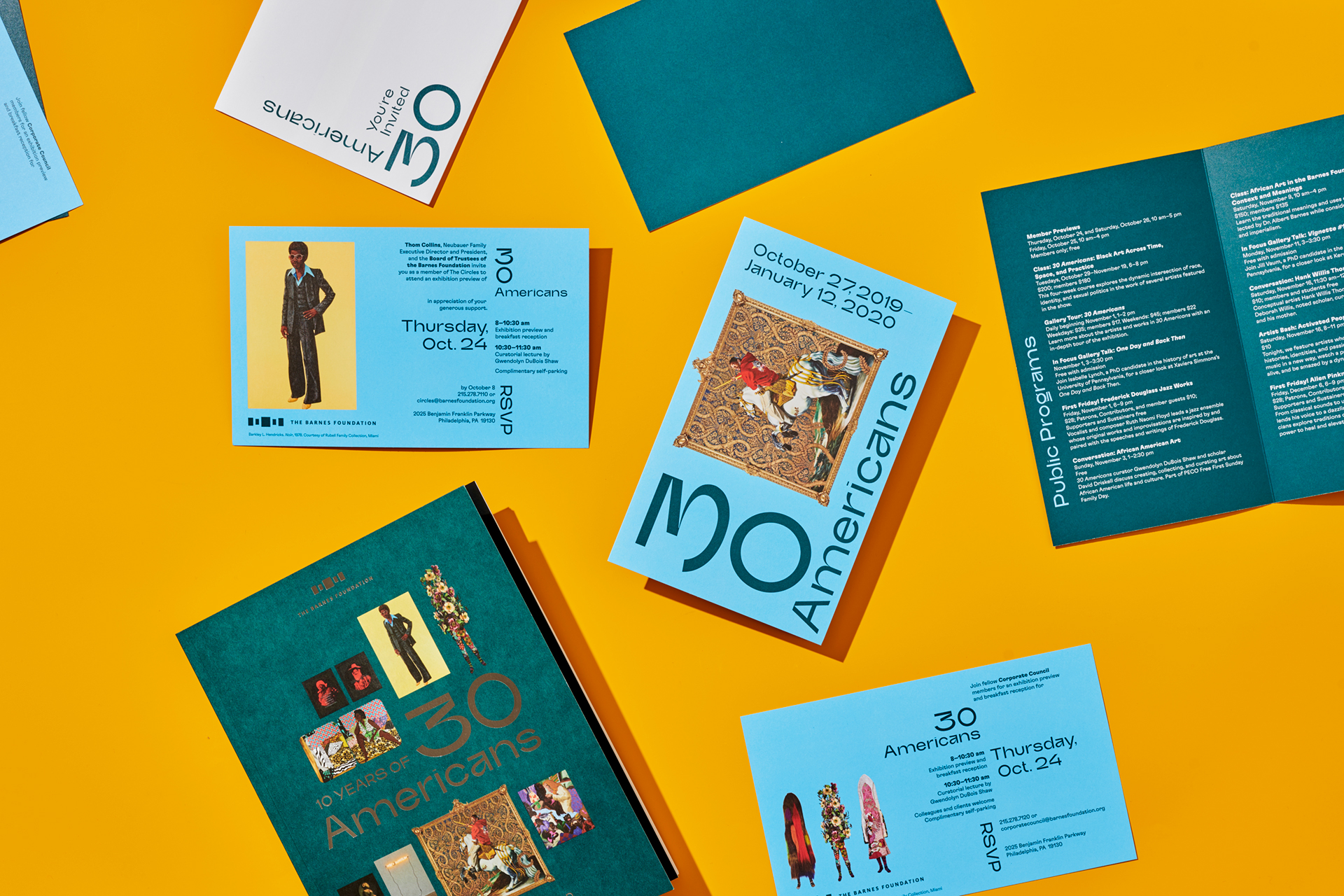



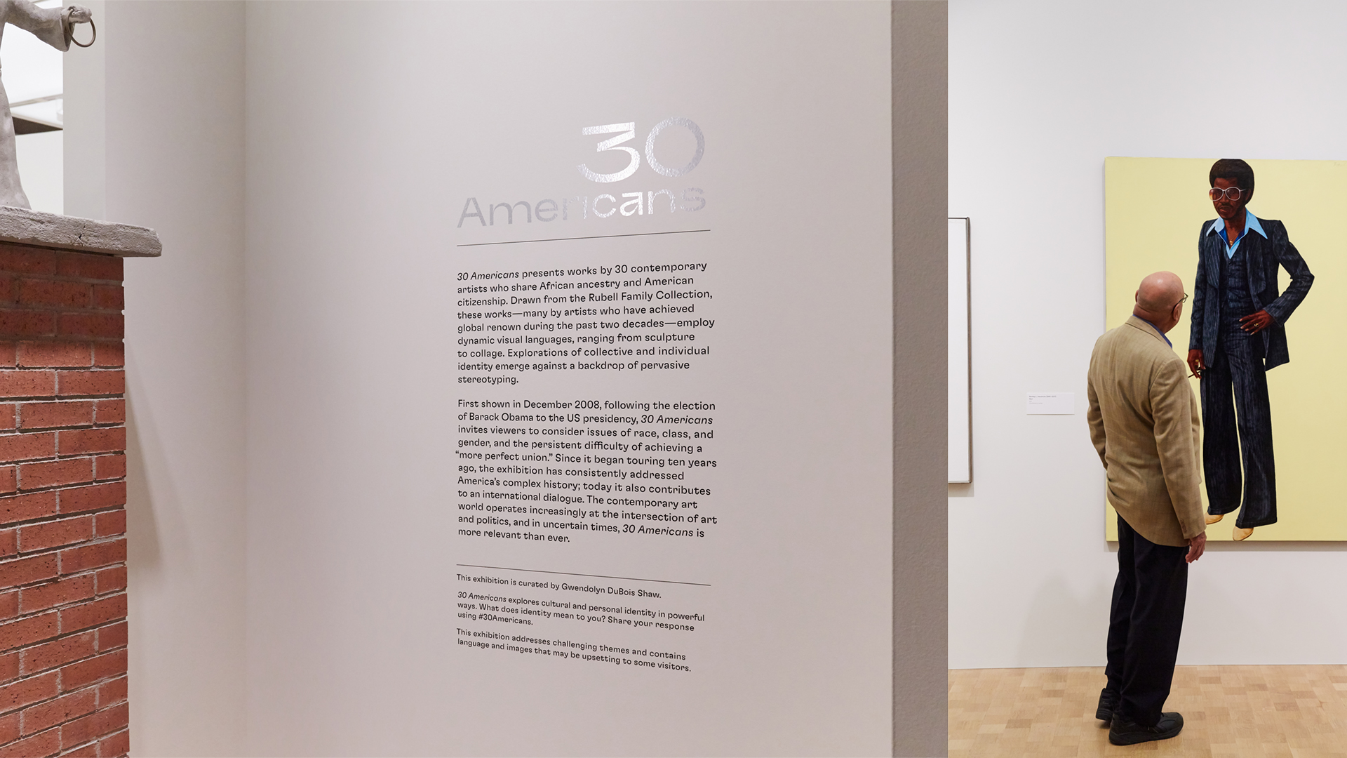
30 Americans showcases works by many of the most important African American artists of the last three decades. This provocative exhibition focuses on racial, sexual, and historical identity issues in contemporary culture while exploring the powerful influence of artistic legacy and community across generations.
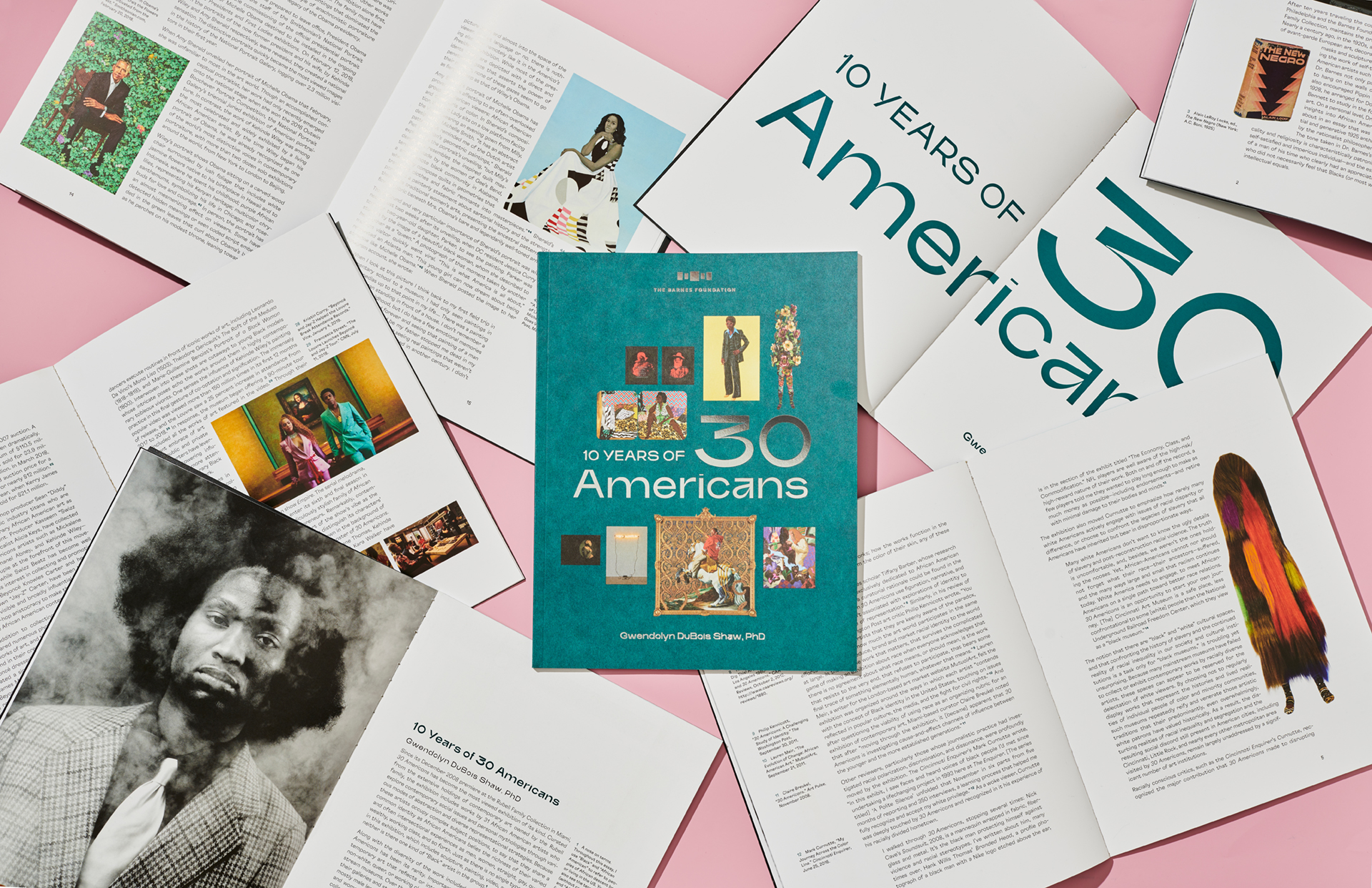
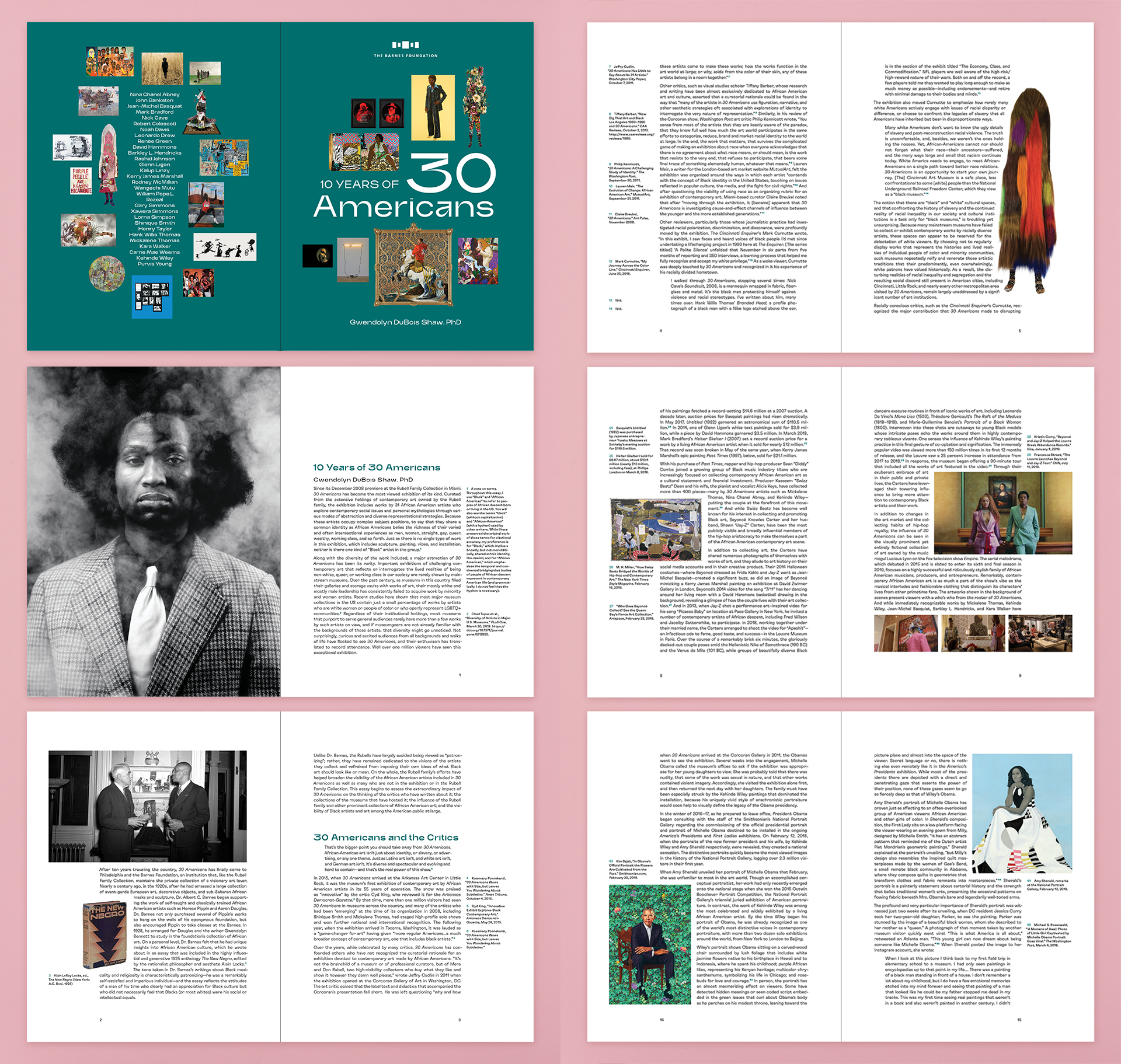
The Barnes presentation marked the tenth anniversary of this groundbreaking show and its debut in Philadelphia. 10 Years of 30 Americans is an illustrated essay by curator Gwendolyn DuBois Shaw, which discusses the historical importance of 30 Americans and its lasting impact on the art world.
We selected the typefaces used in the design of 10 Years of 30 Americans for their unique character and idiosyncratic design. Headlines are comprised of Trash by Brutatype, which displays an elegant strength, while text blocks are set in justified GT Flexa by Grilli Type, a quirky yet clear contemporary typeface. Imagery interrupts the text throughout, breaking up the justified blocks and creating interesting visual patterns, while notes comment on the main content. Notes are set in the margins rather than at the foot of each page to allow for a more conversational relationship between them and the main text.
With silver foil stamping and full-color imagery, the book's cover features a selection of iconic works from 23 of the show's artists. On the front, these works surround a monumental title, and on the back, they encircle a list of names of the 30 artists. With such an impressive roster of important artists and works, we felt choosing just one representative image could not do this presentation justice. Instead, we showed the diversity of mediums and forms that make 30 Americans so special.
+ Type: Trash by Brutatype, GT Flexa by Grillitype
+ Art Direction: Olivia Verdugo
+ Graphic Design: Pauline Nyren and Olivia Verdugo
+ Organizing curator: Gwendolyn DuBois Shaw
+ Exhibition Photography: Sean Murray
+ Flat Photography: Ian Shiver
